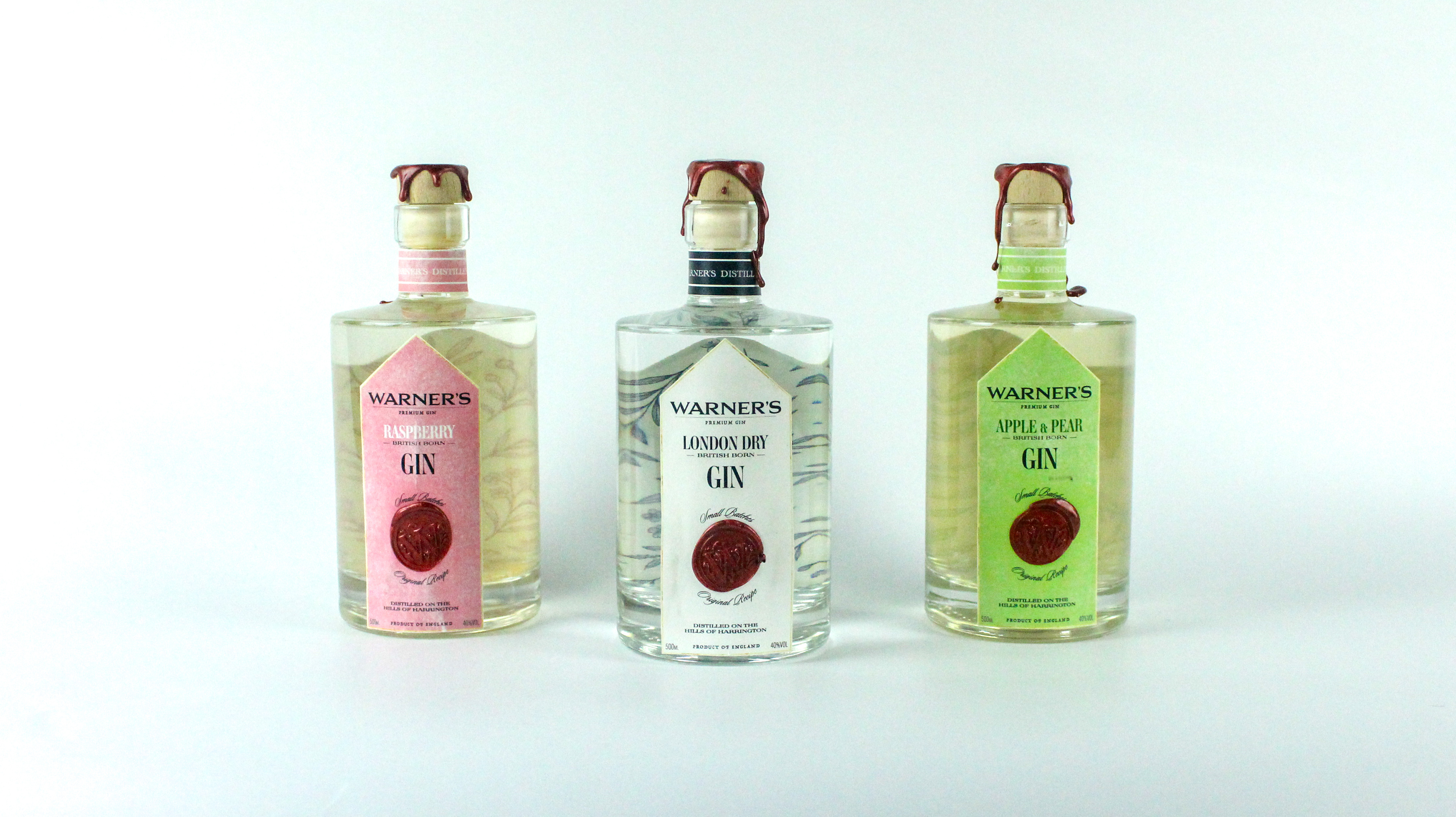
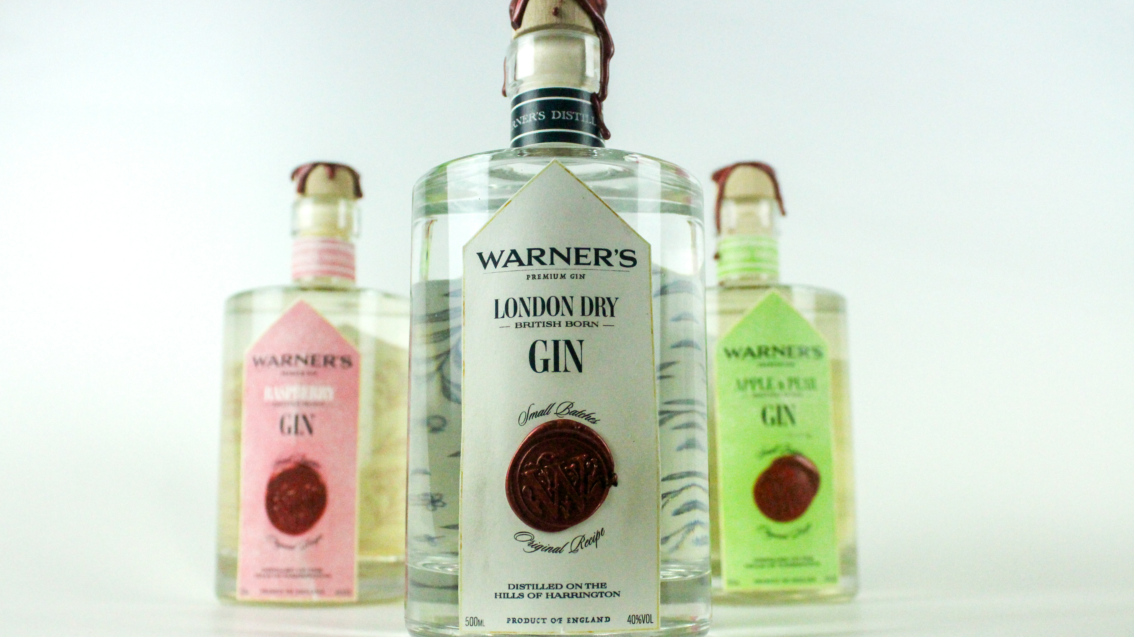
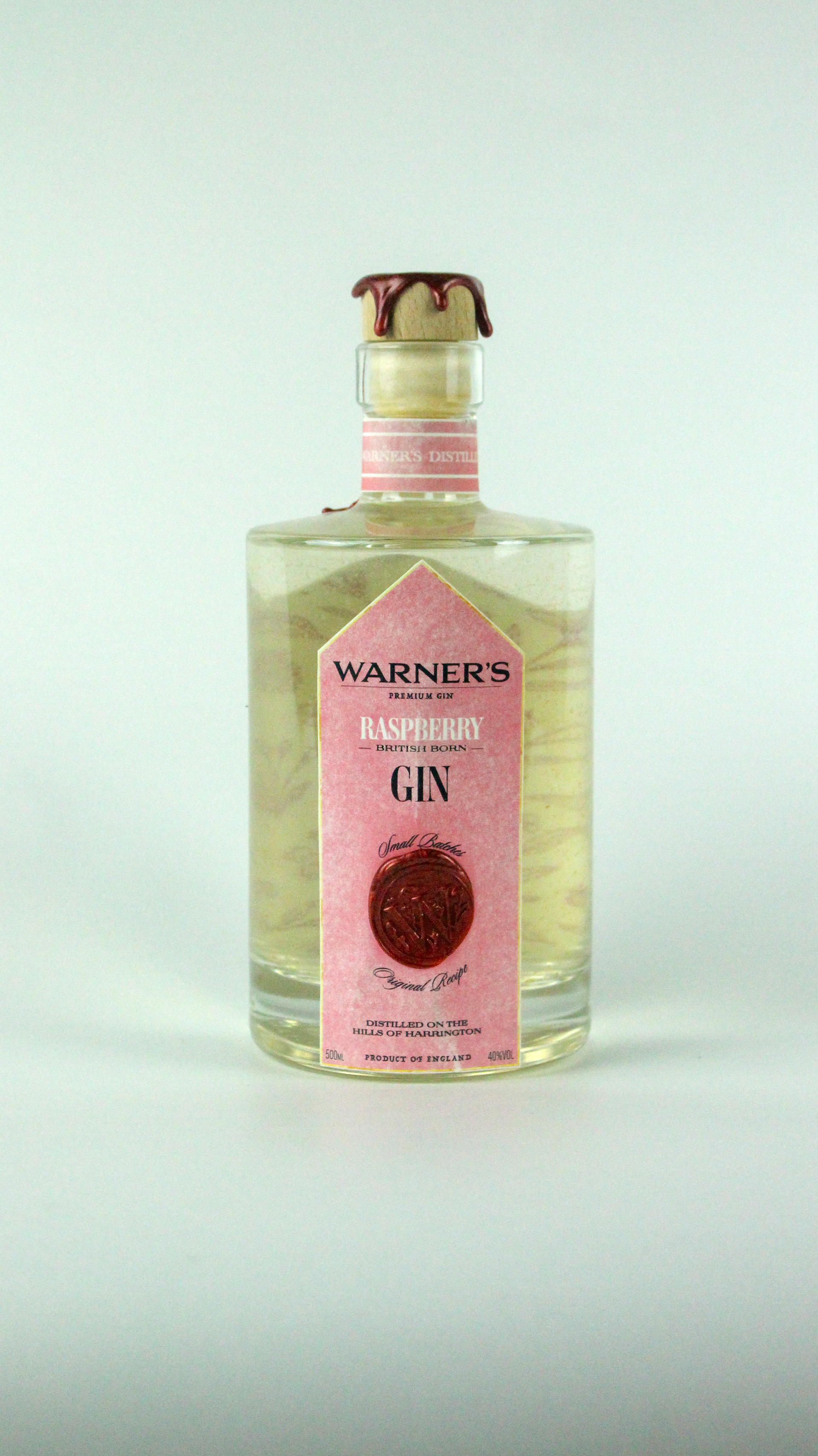
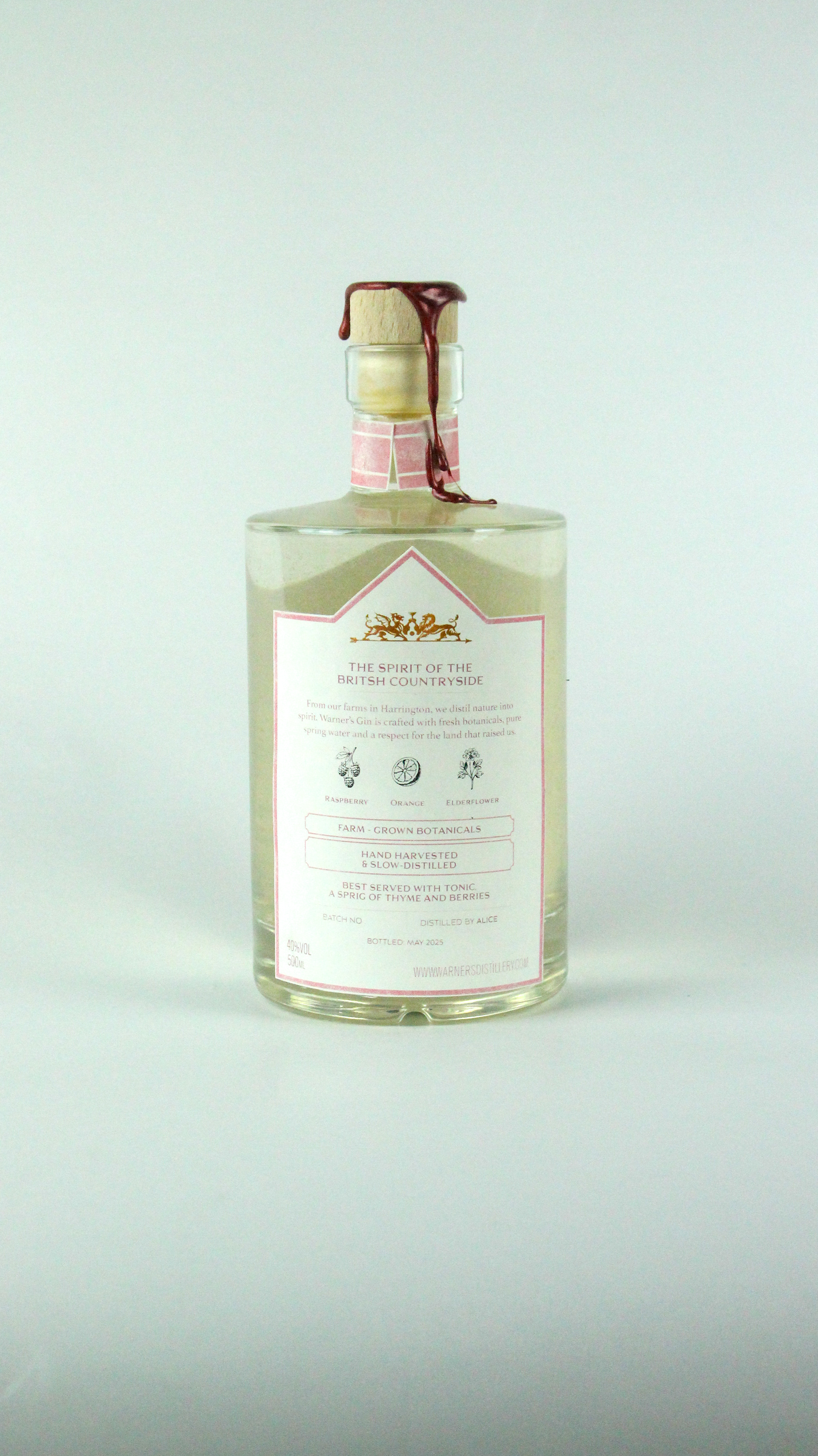
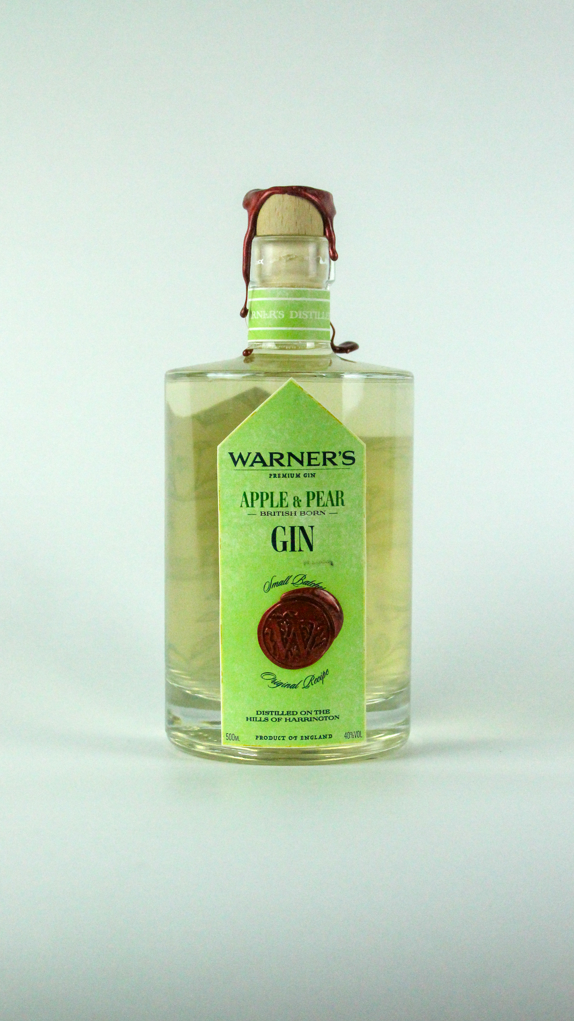
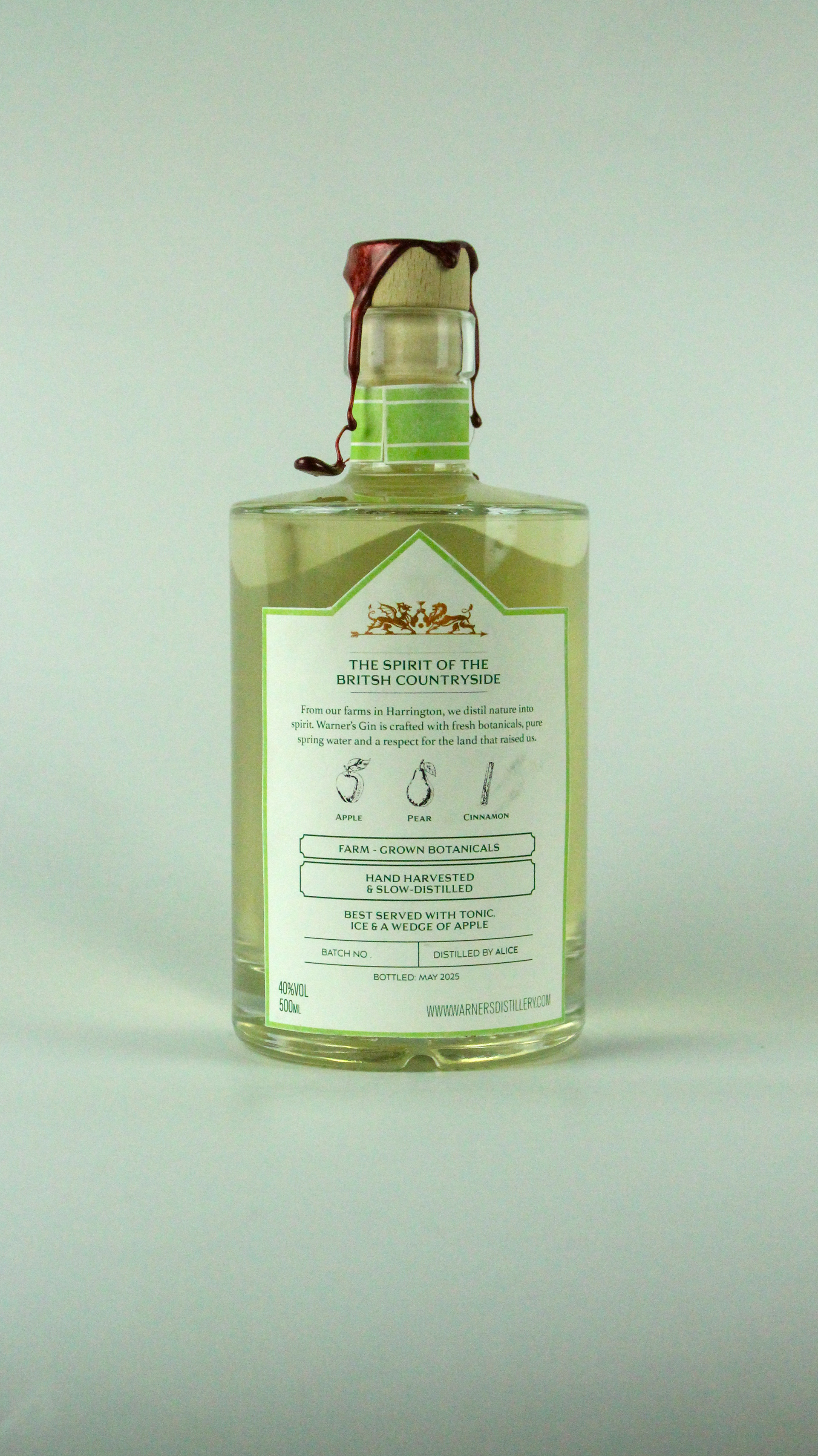

Client: University Project Role: Packaging Designer · Concept & Art Direction This project began with a challenge: to repackage a familiar product in a way that made people see it differently. Warner’s Gin already had a story, it’s distilled on a family farm, using botanicals grown in the British countryside. But its visual identity didn’t quite live up to the complexity of that origin. I approached the redesign with the aim of restoring that connection between product and place. Not through clichés of heritage, but through a visual system that feels grounded, seasonal, and tactile. The design draws from the English landscape, not as scenery, but as a living ingredient in the gin itself. Throughout the process, I thought about how packaging can speak before a product is tasted. How it can suggest the care that’s gone into the making. The new identity plays with contrast, between structure and softness, tradition and freshness, to reflect what Warner’s really is: not just a gin, but history and passion.